Redesign of a Website & Social Media Strategy
This text is based on a draft from a fictive redesign and a social media strategy made as a final assignment at the course “Dynamic Web design” at IT-University, Copenhagen in 2015. The practice of web design is multidisciplinary, but the following text and redesign only concerns branding, emotional design, landing page design, social media strategy, responsive web design and wordpress as the chosen content management system for the redesign.
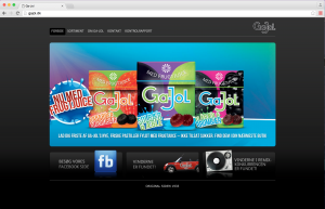
In 2011, GaJol (the danish brand of throat pastilles) implemented a new strategy and product innovation with an danish advertising agency. In 2015, images of the products are still placed on the front page of gajol.dk, even though they are not sold in the supermarkets any longer and the text has not been updated. From a technology aspect the website is also outdated, it is neither mobile-friendly nor responsive. Outdated website can damage the brand, making users frustrated and therefore it is about time to update and redesign gajol.dk.
GaJol
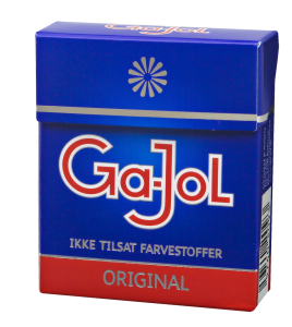
GaJol pastilles soothes the throat, but also gives a nice taste and smell in the mouth. The pastilles comes in different flavour and was established in Denmark in 1933. The slogan “The Danish Weather are GaJol Weather” is well incorporated in the brand and another unique detail for GaJol are the quotes placed on the pastilles packages. GaJol pastilles can be categorized as fast-moving consumer goods with low customer involvement, low price and short shelf life. Since 1971, GaJol are placed under the main brand of Toms with other sub brands. Toms has a modern responsive website on tomsgroup.com, where the sub brands can be found with direction to their own websites, like gajol.dk.
Goals of the Redesign
Brand Awareness The primary goal is to strengthen the brand of GaJol and give a consistent brand experience on all platforms and touchpoints.
Digital Content Strategy The intention of the redesign is to communicate clearly. It is important to update text and images on regular basis and resources for this should be prioritized in the future.
Responsive Web Design In 2014, Google updated their mobile algorithm to favor mobile-optimized sites in their search results. Today gajol.dk is not mobile-friendly and that is critical from the search engine perspective, but also the user aspect. With the mobile internet traffic increasing each year, the redesign of GaJol should be in a responsive web design.
Social Media Strategy It is important to build relationship with the customers, but for a pastille producer it can be difficult to do this on a website, but easier on social media. A strategic social media plan for GaJol should be established.
The original website can still be seen on www.gajol.dk
Target Group
The primary goal of the redesign is to improve the brand awareness of GaJol – not to one specific group, but to all target groups. A few short interviews was done and the main finding is that people eats GaJol like sweets, not like a throat pastilles. The target group can be identified into four main groups; young teenagers, younger people, middle age and old people. Personas can be developed for the groups and used as a tool for finding for example the right social media platform. For active people on the go, mobil internet surfing are becoming more and more important, and therefore gajol.dk should be redesigned in responsive web design. Responsive web design is a web design approach for optimizing the user experience across a wide range of devices and screen sizes.
Brand Awareness
Storytelling The story of Toms are told cleverly and visually on the website of Toms Group, but the story of GaJol is not told in an exciting way on gajol.dk. GaJol has many good stories to be told; it is a genuine danish brand and can recall nostalgic emotions and pride among the danish people.
Visual communication Color, typefaces, images and text are all part of the brand should be communicated consistently on the GaJol platforms. The logo of GaJol is still modern; it was probably designed in the 1930s inspired by Bauhaus. The logo is well-known and should not be changed. The blue color of GaJol Original is now used in the web design as a primary brand color. A sans-serif typography are used for all text on the new website. The visual redesign are simplified.
“Storytelling and visual communications is able to provide the brand with an identity, and the company can use the elements, both together and separately, to reinforce the message and gain a strategic advantage over competing products and brands.” (Winther and Skaaning, 2015)
Emotional design With the tool of storytelling and visual communication the company builds personality into the website and products. The aesthetics plays an important part in the emotional design with well designed buttons, no standardized stock photos, clear navigation and a nomenclature that make sense.
“Emotionally attractive design makes people feel good. It makes them feel like they belong to the product, company or person.” (Jarvis, 2014)
GaJol slogan “The Danish Weather is GaJol Weather”
The Redesign
In the blogpost Does Good Web Design Really Matter? Putnam (2011) writes that design matters and when people reject or mistrust a website; 94% were design related, but only 6% were content related. Putnam (2011) also writes that some of the specific design problems that led to the rejection were complex layout, lack of navigation aids, boring web design, pop up ads and too much text. This design problems are useful to think about, when redesigning gajol.dk. The redesign of the website is not complex – it should work like a static digital business card, but with direct links to Facebook, Twitter and YouTube. Today gajol.dk has a cluttered and nonsense permalink. A more useful and structured permalink is added to the redesign.
Wordpress was chosen as the content management system for the redesign of gajol.dk. The reasons for choosing WordPress is: it is free, easy to learn, global open source platform, large support community and has many available themes and plugins.
Landing page
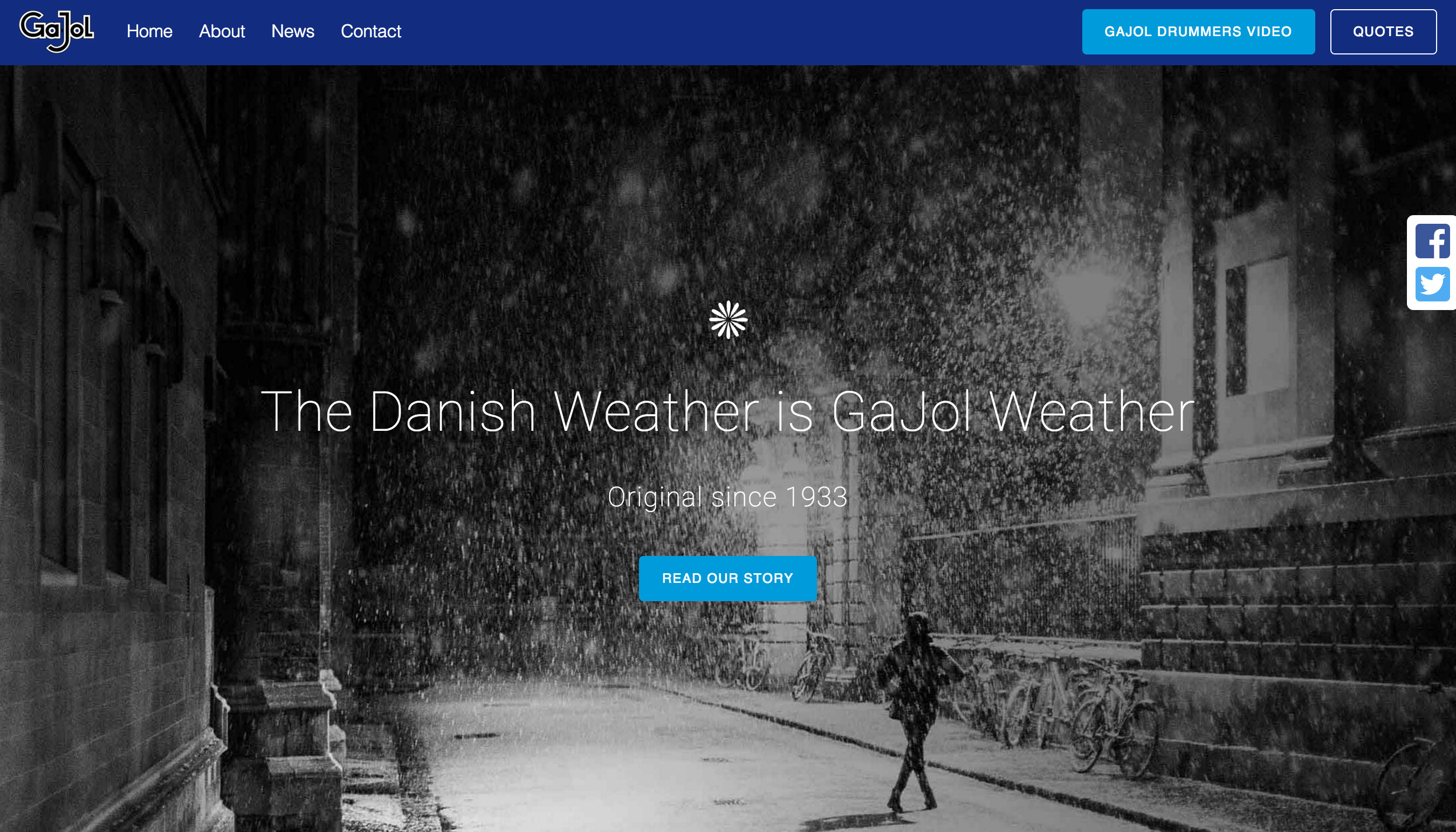
The saying “A picture is worth a thousand words” is relevant for modern front page web design and with improved technology, more advanced browsers and faster internet connections it is now possible with a full-screen background image, also called hero image, on the website. “Less i more” is another saying that suits hero image with the simplicity of one image and one message. The minimalistic design with few elements improves the loading time and increases the user experience of the website. A call-to-action button is placed in the center of the front page with direct link access to the storytelling page named About. Another button GaJol Drummers Video is placed on the top right corner with direct link to a Youtube video.
The intention of the landing page is to impress visitors with trust and delight and thereby improve the brand awareness.
The new landing page of the redesign
Responsive Web Design
Gajol.dk is neither mobile-friendly nor responsive. According to the statistic from a Mobile Media Consumption report (Sterling, 2014) the internet access is made from:
- Mostly via Desktop — 11 percent
- Evenly split between both mobile and PC — 28 percent
- Mostly via mobile — 37 percent
- Only via mobile — 23 percent
Responsive web design is becoming more and more important as the mobile internet traffic increases and therefore the redesign of gajol.dk is now responsive.
Social Media Strategy
GaJol is scattered all over the social media without a clear strategy, therefore the plan should be to assemble the brand on a few social media platforms. The primary goal for GaJol on social media is to build and maintain customer loyalty and increase brand awareness. Ga-Jol should consider the type of content, time of posting and frequency of posting.
Three social media platforms are integrated into the redesign:
- According to Statista (2015), Facebook have 2.9 millions users in Denmark and with such a large group of users, Facebook is chosen as the primarily social media for GaJol. Facebook can be used as a communication tool for support, news updates and actively engaging the followers.
- An official Youtube channel should be established and all of GaJol videos should be placed under this channel.
- The Twitter account should be activated again with #detgodecitat. The hashtag should be used on all platforms and touchpoints.
Starbucks’ social media strategy is known for its success (Poirier, 2014) and GaJol should get inspiration from the list when communication on Facebook and Twitter:
- Listen
- Be transparent
- Be human
- Share timely information
- Offer personal attention
- Be humble in replies
- Don’t preach
- Give fans access
- Don’t spam users
Evaluation
The redesign of gajol.dk should be refined on an ongoing, iterativ process and be tested on users. The social media functions on the website should be tested to see if it fulfill its purpose. The redesign of the front page has been tested on five users. Four out of five users answered yes to the question, if the brand appears trustworthy. To the question which elements attracts most attention, the users answered the image. To measure the success or failure of the redesign, different methods can be used, for example:
Brand awareness Look for increased sales of the GaJol pastilles and mentions on internet.
Responsive Web Design Look at the statistics from Google Analytics and see if the traffic increases on the site. The search engine ranking should be improved with the new mobile-friendly solution.
Social media Look at the engagement on the social media (followers, likes, shares, views, comments etc.) and the number of times GaJol is mentioned on social media. The hashtags #gajol and #detgodecitat should be searched for and observed.
Conclusion
Updating text and images on the website gajol.dk is not prioritized from the GaJol direction today and therefore it is difficult to see why GaJol should have a dynamic website. Even though this project gives an example of a redesign of gajol.dk as part of the course – the final conclusion is that GaJol should have a Facebook company profile instead of a website. On Facebook, GaJol can easier engage, communicate and support followers and they only have to update news and information on one platform. This means in the end, that the website of gajol.dk should cease to exist and the URL gajol.dk should be linked directly to the Facebook profile instead. Today, GaJol already have a Facebook profile, so it doesn’t mean any further expenses for them.
The redesign can be found on www.louisemjeppesen.dk


