Visibility on the front page
Working as a designer in my own graphic design consultancy Keep Your Darlings – I am pleased to see that websites are becoming more and more visual and not being so text-oriented any longer. The improvement of technology, more advanced browsers and faster internet speed are three factors that makes the visual website presentation possible.
The front webpage is the first encounter a visitor might have with a website and therefore it should be like the cover of a book; aesthetically attractive, eye-catching and act as an ambassador for the rest of the content of the site.
The saying “A picture is worth a thousand words” is relevant for modern front page webdesign and with the improved technology – it is now possible with fullscreen images on the website. For example the hero image is a high quality fullscreen background image placed on the front webpage. Hero images is a powerful tool for brand reinforcement, used for example by apple.com.
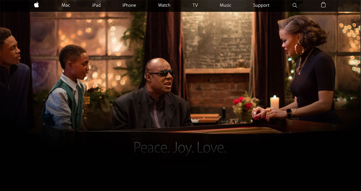
Example – Hero Image

Apple.com (danish version) with hero image and a carousel with four different large images rotating.
“Less i more” is another saying that suits hero image with the simplicity of using one image and one message.The minimalistic design and few elements improves the loading time and increases thereby the user experience of the website.
While working with hero images on your front page webdesign – you will need to have aesthetic and conceptual skills – don’t just place any image there. A photographer could be involved in capturing the image with the right light and contrast. For the best results the image should be uniform with a few colors and with heavy contrast between the image and the text.
There is a risk with hero images as well. The visitors might judge the whole website on the front image. And if they don’t like what they see – they might not want to move to the primary content of the website.
Another issue can be hero images on smartphones; how does the image look and act on different devices? If the website are designed in open source content management system WordPress – most of the themes with hero images are responsive. Responsive design means that the website are adapted to different devices and screens. The wordpress themes comes with static pages, but can also have a carousel or a rotating slider, both for the image and the text.
The webdesign trend might be the hero images in 2015. But what will happen with webdesign in 2016? Maybe it will be design with fullscreen videos on the front page – that will be the next top trend in Denmark. They are actually already doing it abroad – like matterofform.com, bkwld.com and whiteroom.agency.